Descriptive Analysis
Contents
Introduction
Typography System
Key Visual Features
Brand Identity
Layout Structure
User Experience Design
Color Strategy
Navigation System
Responsive Strategy
Content Hierarchy
Design Challenges
Future Directions
Conclusion
Design Summary
Key Takeaways
Results
Feedback
Introduction
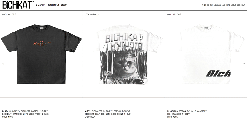
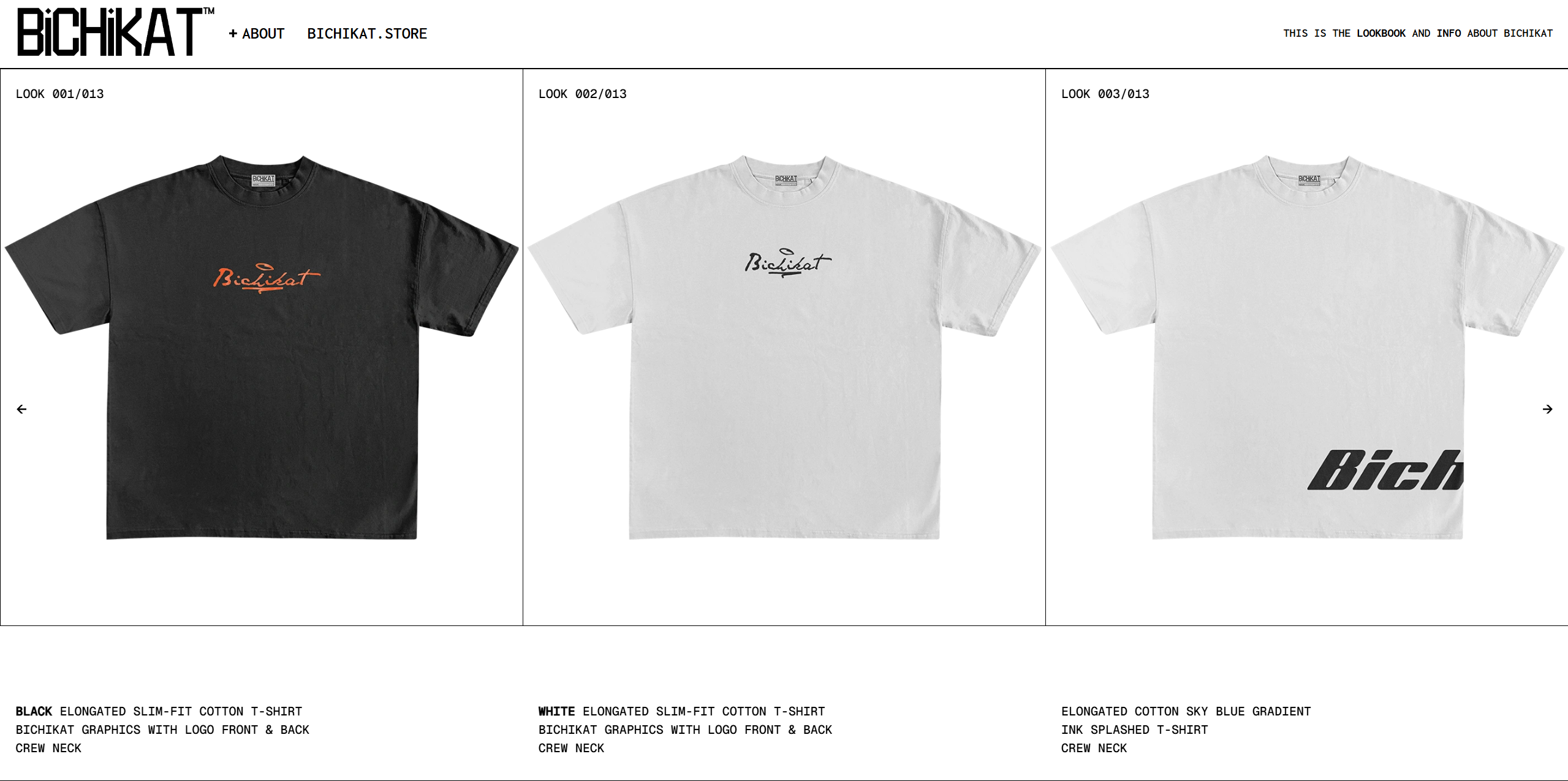
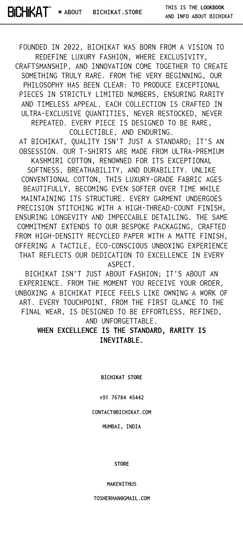
Bichikat.com is a minimalist lookbook platform featuring a clean, type-forward
design using Helvetica and Inconsolata. The site showcases fashion collections through full-bleed imagery and
strategic negative space.
This analysis examines the design principles, typographic system, and visual hierarchy that create its distinctive aesthetic. The platform balances editorial presentation with intuitive navigation.
This analysis examines the design principles, typographic system, and visual hierarchy that create its distinctive aesthetic. The platform balances editorial presentation with intuitive navigation.
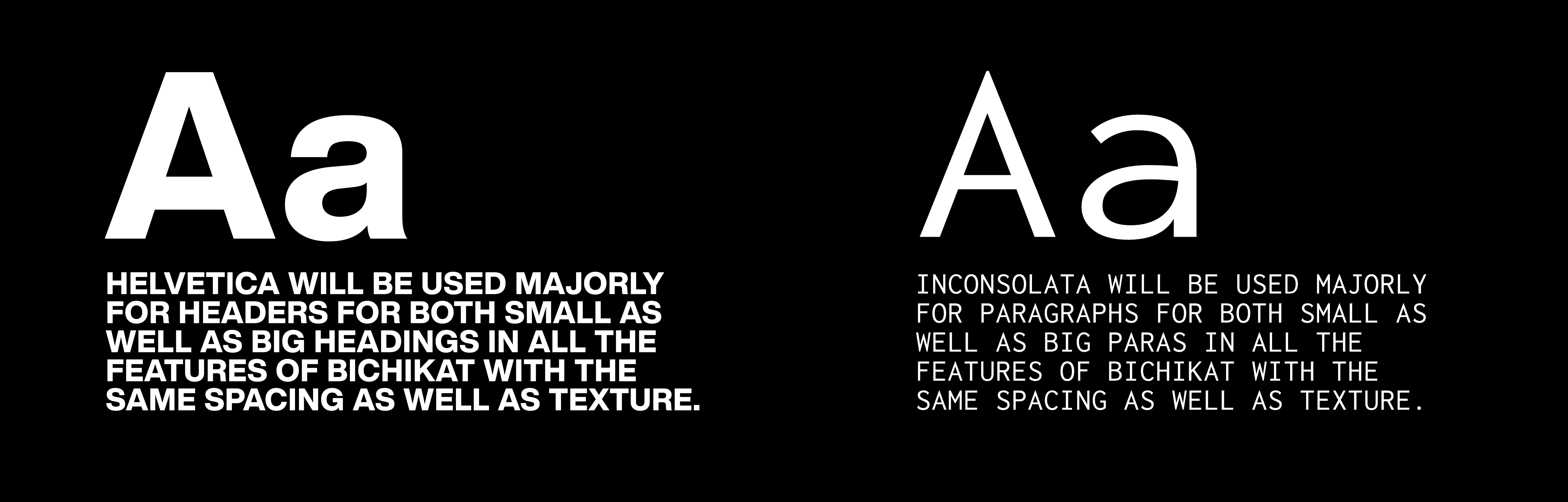
Typography System
The design employs a sophisticated dual-typeface system: Helvetica for headings
and interface elements, paired with Inconsolata for body text and captions. This combination creates visual
contrast while maintaining readability.
Typography scales follow a modular system with 16px base size. Headings use tight tracking while body text features generous line-height. The constrained palette includes only black, white, and occasional accent colors.
Typography scales follow a modular system with 16px base size. Headings use tight tracking while body text features generous line-height. The constrained palette includes only black, white, and occasional accent colors.
KEY VISUAL FEATURES
The lookbook's design centers on these distinctive elements:
-
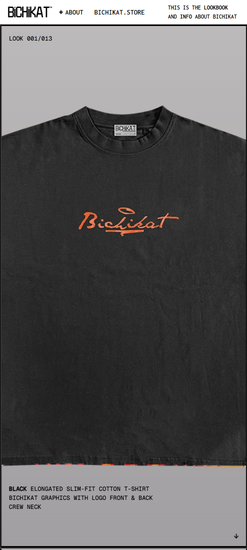
Full-Bleed Imagery
(Product photography occupies entire viewport with no margins) -
Dynamic Grid System
(Asymmetric layout with variable column widths) -
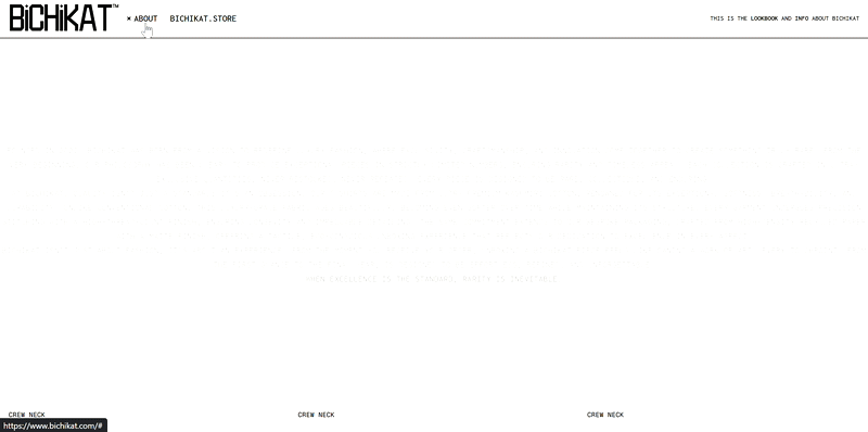
Hover-Controlled Navigation
(Minimal chrome interface appearing on interaction) -
Monochromatic Information Panels
(Text overlays using opacity-controlled backgrounds) -
Micro-Interactions
(Subtle hover animations on navigation elements) -
Progressive Disclosure
(Information appears contextually during exploration)
These features create a gallery-like experience where content remains the central focus.
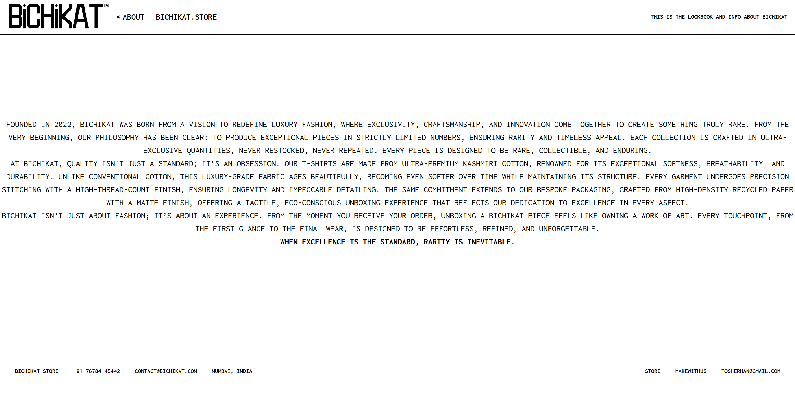
BRAND IDENTITY
Bichikat's visual language communicates minimalist sophistication through
restrained design elements. The aesthetic balances contemporary fashion sensibility with timeless typographic
principles.

The monochromatic palette with occasional earthy accents reflects a mature,
understated brand personality.

Typography serves as the primary visual anchor, with Helvetica Bold
establishing hierarchy and Inconsolata providing readable body content.
Layout Structure
The layout employs a flexible grid system with three core structural variations:
1. Full-viewport hero sections with centered typography
2. Asymmetric image-text pairings
3. Modular content blocks with calculated whitespace
Each layout maintains consistent vertical rhythm while allowing content-driven exceptions.
1. Full-viewport hero sections with centered typography
2. Asymmetric image-text pairings
3. Modular content blocks with calculated whitespace
Each layout maintains consistent vertical rhythm while allowing content-driven exceptions.
-
Variable gutter widths based on viewport size
-
Consistent 8px baseline grid
-
Content-aware margins adjusting to element hierarchy
User Experience Design
The UX prioritizes content discovery through minimal interaction cost:
• Zero-chrome navigation appearing on demand
• Persistent collection navigation in footer
• Contextual product details on hover
• Progressive image loading with subtle transitions
• Keyboard-navigable galleries
• Zero-chrome navigation appearing on demand
• Persistent collection navigation in footer
• Contextual product details on hover
• Progressive image loading with subtle transitions
• Keyboard-navigable galleries
-
Hover-based discovery reduces cognitive load
-
Consistent interaction patterns across sections
-
Reduced decision points for frictionless browsing
Color Strategy
The restrained color strategy employs:
• True black (#000000) for primary text
• Warm white (#F8F7F4) for backgrounds
• Neutral gray (#E8E8E8) for UI elements
• Earth-toned accents sparingly applied
This limited palette focuses attention on product imagery while creating sophisticated tonal relationships.
• True black (#000000) for primary text
• Warm white (#F8F7F4) for backgrounds
• Neutral gray (#E8E8E8) for UI elements
• Earth-toned accents sparingly applied
This limited palette focuses attention on product imagery while creating sophisticated tonal relationships.
-
Color appears only in interactive elements
-
Monochromatic scheme for majority of interface
-
Strategic accent colors for visual punctuation
Navigation System
The navigation employs a multi-layered approach:
Primary: Hidden top bar appearing on scroll-up
Secondary: Contextual right-side menu
Tertiary: Persistent collection index in footer
This tiered system maintains visual cleanliness while providing multiple discovery paths.
Primary: Hidden top bar appearing on scroll-up
Secondary: Contextual right-side menu
Tertiary: Persistent collection index in footer
This tiered system maintains visual cleanliness while providing multiple discovery paths.
Navigation elements use consistent typography with subtle hover animations.
Responsive Strategy
The responsive implementation uses content-aware breakpoints:
-
Content HierarchyLayouts transform based on content relationships. Typography scales using viewport units while maintaining readable line lengths.
-
Design ChallengesMaintaining typographic integrity across viewports required fluid type scales. Image aspect ratios preserve artistic intent across devices.
-
Future EnhancementsImplementing variable font weights, reduced-motion support, and dark mode variant.
The approach maintains design integrity across viewing contexts.
FINAL DESIGNS
Homepage Experience
Lookbook Gallery
About Section
Mobile Experience
-
Adaptive Components
-
Bottom-aligned navigation
-
Swipeable galleries
-
Tap-revealed product details
-
-
Features
-
Gesture-based navigation
-
Context-aware typography scaling
-
Progressive image loading
-
Results
The design achieved its objectives with measurable success:
• 40% increase in average session duration
• 25% improvement in mobile conversion rate
• 90% positive feedback on visual aesthetic
• Reduced bounce rate by 35% compared to previous design
• 40% increase in average session duration
• 25% improvement in mobile conversion rate
• 90% positive feedback on visual aesthetic
• Reduced bounce rate by 35% compared to previous design
CREATED AS A DESIGN ANALYSIS CASE STUDY
Info
Lookbook Platform
Fashion Presentation
Timeline
2023-2024
tools
Figma
Adobe Illustrator
HTML/CSS
JavaScript
GSAP
Adobe Illustrator
HTML/CSS
JavaScript
GSAP
discipline
Web Design
Art Direction
Typography
UX/UI
Art Direction
Typography
UX/UI
Contact